Brandon Joseph Baker Info

My Photo
San Francisco, California
A place to share the works that inspire me.

20130310

WHITE WALLS GALLERY | 10 Year Anniversay Show, New Discoveries

Last night was the 10th anniversary show at White Walls Gallery and the first show I've seen in their new space, which is awesome. The show was packed as per usual and the art was as strong and well curated, also as per usual. I'd seen some of the artists before; Herakut, Ferris Plock and Shepard Fairey but was really blown away by these three that I'd never seen before.

HELEN BAYLY. She is a San Francisco based artist who studied at SFAI. Her illustrations kept me standing in a crowd of chattering girls and stoned gangsters for much longer than I usually would have been able to stand. Absolutely beautiful line work. She draws like Leonardo da Vinci gave her a couple private lessons on how to properly capture Michelangelo's sculptures. This was the highlight of my night and I hope to see more of her work in the future. Check out more of her work here.
AUGUSTINE KOFIE. I was struck by the use of black in the highly precise layers of lines. I'm usually drawn to the use of black in a piece but these were so subtle it took a while for me to really decipher what I found so compelling about this Los Angeles based artists work. The attention to detail, precise and exact line work with hints to architectural plans blend beautifully in his pieces at the show. My words don't do his work the justice they deserve, for more of his work visit his site keepdrafting.com.
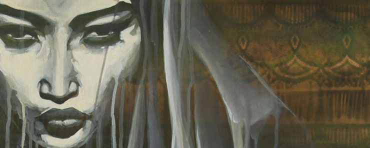
 FAITH 47. I love when ink or paint runs across a surface. I use it in my own art and appreciate when another artist does it better than I can. Faith 47, a South African artist has perfected this technique of adding texture with the paint running across a canvas or wall. The pieces at the White Walls show don't use this technique as much as some of the mural work I've seen but it's still beautiful and well superbly executed. Explore more of her work on her site, faith47.com.


20120831

PIXELS | PATRICK JEAN

A little late for cutting edge relevance, this came out in 2010, but I really liked it. I started looking up a little more for this post and decided it really is irrelevant. Just watch the video. It's great.

20120826

Aakash Nihalini | Photography

Ever a fan of adding illustrations to photographs (honestly stemming from a complete infatuation with both Jessica Rabbit and Holli Would as a boy), I really love this work by Aakash Nihalini.
Found originally on : It's Nice That

20120810

DAVID BYRNE'S HOME | GIL INOUE

A long time fan of Talking Heads and an even bigger fan of the mystique of David Byrne seeing this posting on itsnicethat.com was a real inspiration. I still want to meet Byrne randomly in an elevator someday.


Originally found on it's nice that.com

20120722

WATER FALLS OFFICIAL VIDEO | KEVIN B PARRY

I fell down the interwebs well of discovery today from a post on Upper Playground (love this shop) to This Is Colossal (a wonderful art blog) to an animator named Kevin B Parry (I'm going back to soak up the rest of his work asap) and his work for Kallie Matson (see below and download the music). Follow the links for yourself but first watch this video. There's an explanation on Upper Playground about how the animated sequences are done if you're interested. I personally think it's much more fun to appreciate the work than to figure out how it's done. 


20120715

The editing in this video by Ramon and Pedro is wonderful. It almost feels like a one long cut, almost. For more from Ramon and Pedro visit their website, ramonandpedro.com.

Le Miroir from ramonandpedro on Vimeo.

20120405

SILVER AND LIGHT | IAN RUHTER

This really makes me miss the process of analog photography. I've never done this elaborate style of large scale printing but respect the devotion to the craft. Beyond the nostalgia of the process this video is really beautifully shot and tells a really compelling story. 

SILVER & LIGHT from Ian Ruhter on Vimeo.

20120227

GOTYE | EASY WAY OUT

If Michael Gondry and Tim Burton had their brains infused into a nihilist's journal entry and set to music, it may look a little like this. Worth mentioning none the less.
Found at booooooom.com

20120218

BRIEF ENCOUNTERS TRAILER | GREGORY CREWDSON

As a long time fan of Gregory Crewdson I'm really stoked to see a documentary made about his process. His work is absolutely breath taking to see in person and makes his movie production style of creating stills justified. I doubt I'll make it to SXSW this year for the premier. If it screens in San Francisco, I'll be there.

Gregory Crewdson: Brief Encounters Trailer from Benjamin Shapiro on Vimeo.
For more on Crewdson visit aperture.org/crewdson/ or find his work in a gallery close to you and experience it first hand.

20120213

BARNABY WARD | SOMEFIELD

The Black Harbor had a great post about Barnaby Ward, aka Somefield, last week. I was unfamiliar with the work but was instantly drawn to the solid color backgrounds, bright simple pallete, pen and ink style illustrations and most importantly pairing of fantastic monsters with unimpressed girls. It reminded me of Zak Smith's work focused through Ritalin (only offered as an observation, not a judgement on either artist's work). After further exploration of the work I had to share. He has a great comic on his site, Sixteen Miles to Merrick, that I am excited to return to shortly. For more from SOMEFIELD visit here and RSS Black Harbor when you get a chance.


20111222

SEED | STOP MOTION ANIMATION

This short animated film by Ben Richardson and Daniel Bird was the highlight of my morning. Their 11 minute piece is an exploration of evolution fueled by competition and won Best Animated Short at Slamdance 2010.


"An egg and an apple build competing broadcast towers that vie for the attention of a transistor radio. With its complex characterization and narrative of animal evolution, competition and reproduction, SEED is a beautiful and sinister stop-motion story about the struggle to survive." - Seed Movie Vimeo Channel.


Found on FUBIZ.net

20111213

JIM SANBORN | PHOTOGRAPHY

I ran across the work of Jim Sanborn last night right before turning in for bed. The images remained heavy in my memory as I drifted off to sleep before I arose a few hours later to look at them again. These images are from his work titled The Topographic Projections and Implied Geometries Series.  According to the description on his website the images are shot on moonless nights with a large projection almost a 1/2 mile away from the subject/landscape. I can only speculate on the intricacies of his process from location selection, exposure length and camera selection.

The flatted distortion from the projected light on the landscape reminds me of cast light from the headlights of a car on a empty road. The geometric patterns counter act the flattened distortion by bringing depth back into the images instilling a surreal dream quality to these night photographs.

For more on Sandorn visit his website jimsanborn.net


20111208

KEVIN COOLEY | PHOTOGRAPHY

Kevin Cooley's works are beautiful and surreal with an isolated transcendentalism feeling to them. His landscapes are calm observations of nature with and without the influence of man. I love the combination of long exposures and the introduction of light. His work featuring the human element is also quite compelling. The vastness of our environment when put to scale by a single human form is a reminder of how small we truly are. For more of his work please visit his website and take the time to watch the videos he has there of the pink raft and the flights out of JFK Airport.


http://www.kevincooley.net/

20111125

TNF LOOK BOOK | JAPAN

In September I started working for The North Face. [I'm the Photo and Video Coordinator and my role is to create product photography and videos for our website, TheNorthFace.com, and for internal and external marketing use. The role has been beyond rewarding and I'm very happy with the work I'm doing and the teams I'm collaborating with.] While discussing brand design and direction with a coworker recently the TNFlook.com site came up. TNFlook is a Japanese version of The North Face. It is run separately and independently from the brand I work with daily. I like the styling, aesthetic and functionality of the TNFlook site. Below are screen captures from the sites animations showing the products layering story. These styles of animations have gained a bit of notoriety and hipster acclaim lately. I too have dabbled in these animations in both my IandI series and Press-X series. I really enjoy the bold difference in the brand interpretation and the site experience.


Note how great one can look with a tie and a jacket from The North Face. [A reference only one who knows how much I miss wearing a tie daily will understand]
The site has a travel gallery feature that includes images taken from around the world. I love images like this from the casual observer or amateur photographer. I used to work in a printing lab in Lawrence, Kansas and always enjoyed seeing vacation photos from places I've never been.


20111123

MICROWHAT | PHOTOGRAPHY

I just started following a great tumblr called Microwhat. It's a simple equation. object + microwave X time = microwhat.
Visit microwhat.tumblr.com for more.